Case Study
Website Redesign
Problem Statement

The previous ATEEQ website consisted of a single landing page with minimal information and no portfolio of work. As an architecture studio, showcasing project imagery is essential. The absence of a project portfolio created a barrier between prospective clients and the firm.
Additionally, the limited content created an online perception that did not accurately reflect the studio’s real-world expertise, which affected both credibility and client acquisition.
Solution
Working closely with the ATEEQ team, I redesigned the website to expand it beyond a simple landing page into a more comprehensive platform that better represents the studio’s work and expertise.
The new structure includes the following sections:
-
Homepage
An overview of ATEEQ’s services and design approach.
-
Projects
A portfolio section where potential clients can explore the studio’s work and capabilities.
-
Services
A dedicated space explaining the services offered and highlighting the team’s expertise in the field.
-
About
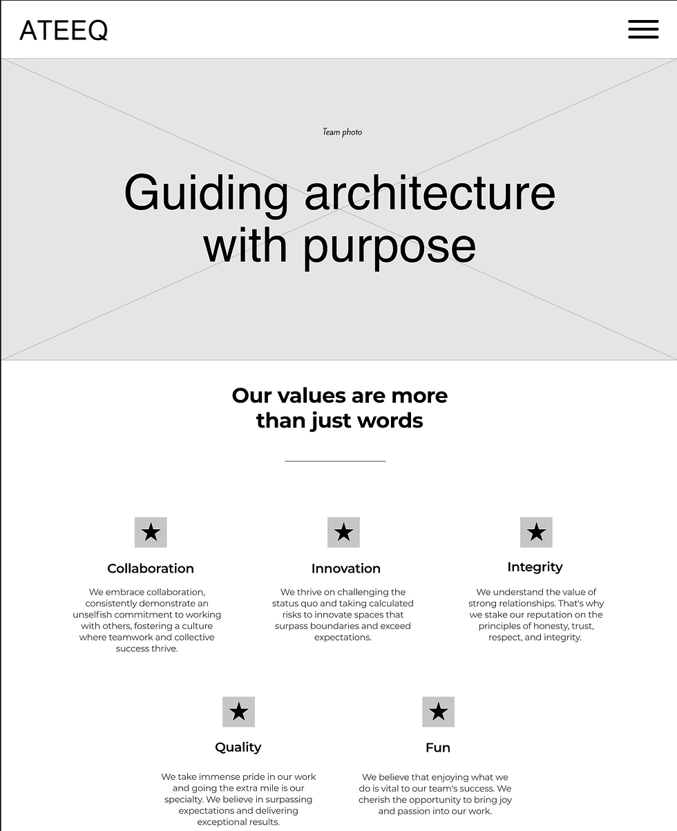
A section presenting the firm’s core values along with testimonials from previous clients.
-
Team
Since ATEEQ places strong importance on its team, a dedicated section was created to showcase its members. This includes an index page listing all team members and individual profile pages with biographies.
A key requirement was ensuring that users could easily contact the studio from any part of the website. To support this, clear call-to-action buttons were incorporated across all pages.

Project Duration
Tools Used
8 weeks


Design Process
Kick Off
Meeting with the client to align expectations and better understand the company.
During this meeting, I gathered information about the client’s goals, core values, and preferred visual style.
Research
The research phase focused on understanding the client’s brand, analyzing competitors, and identifying visual styles that aligned with the company’s identity and architectural approach.
Low Fidelity
Wireframes
Figma was used as the primary tool to develop the wireframes.
High Fidelity
Mockups
igma was used as the primary tool to create high-fidelity mockups that defined the website’s structure, layout,
and visual style.
Implementation
The website was built using Squarespace as the primary platform, with additional customization through HTML, CSS, and JavaScript to achieve a more tailored design and functionality.